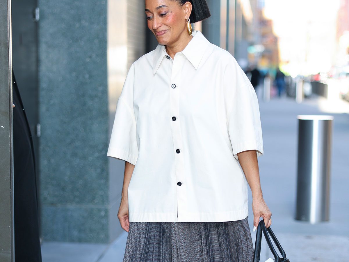
The fall favorite is still in style.
We all need a break sometimes.
A break from the ceaseless continuum of quotidian living (the years start comin’ and they simply do not stop comin’, as that famous Smash Mouth song would have us believe). A break from the people that make this living slightly less liveable; “hell,” after all, “is other people,” Sartre notes.
(Thank heavens my boss doesn’t read PurseBlog.)
And we also need a break (or dare I say, hold some space?) from the constant barrage of TikTok trends dictating color-specific dress-codes in time for tomato/cherry/lemon/strawberry/insert-fruit-name girl summer that paint our feeds and haunt our nightmares in nauseating notes of bold red or brat green or butter yellow or mocha mousse… sometimes all at once.
Now, one would imagine that therapy–with its heavy couches, Venetian masks, plastic plants, and occasionally a therapist–would provide us with that much-needed escape. And one would be very wrong to imagine that.
Because therapy would likely also remind you of this year’s hottest color trend – burgundy. So yes, burgundy for spring? Groundbreaking indeed!
The Burgundy Blitz
And of course, we have Sigmund Freud to blame for that.
Could the man have foreseen TikTok turning rubicund red some 139 years after he first slathered his now-iconic couch in varying degrees of burgundy, Bordeaux, oxblood, and merlot? Unlikely. Are therapists today drowning their offices in a deluge of deep reds and maroons, nevertheless? Yes, yes, they are.
But there’s also no denying the sheer, for the lack of a better word, pull of red. Coca-Cola’s VP of global design, James Sommerville, dubs its tell-tale red tone the brand’s “second secret formula.” Christian Louboutin’s original red-soled Pensée heel prototype—devised by applying his assistants’ red nail varnish (now the trademarked Pantone 186C)—paid tribute to Andy Warhol: wearable yet pop, fit for the French women averse to wearing color.

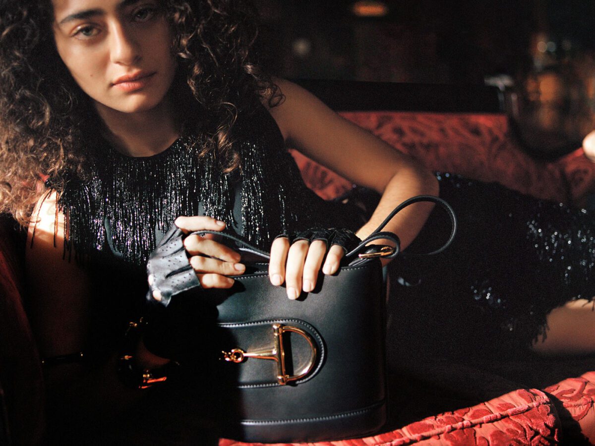
Burgundy, though – or Bordeaux, as it’s currently dubbed – doesn’t scream for attention like its Warholian kinfolk. It’s quieter (dare I say, quietly luxurious?). It harks back to the Gods and kings of ancient Rome (Emperor Caligula reportedly killed a visiting guest for daring to wear Tyrian purple – its not-so-distant cousin). It reminisces of lush velvets, sumptuous satins, and delicious leathers, even from the other side of an otherwise sterile screen.
Since late last year, Google searches for the shade have been at a five-year high, with Lyst clocking in a 666% increase in interest. The popular Instagram account @databutmakeitfashion reported a whopping 76% bump in burgundy’s popularity last week alone!
So, how has this classic cold-weather cliché (a “navy red,” as an editor calls it), in its myriad forms and manifestations—from bolder, cherry-hued tints to the warmer undertones of mahogany and oxblood—managed to infiltrate and inundate the luxuryverse so widely, even as we officially head into spring?
The Sabato Snafu
“If you didn’t know what Ancora meant before the latest thusly titled Gucci show,” writes Amy Odell, “you almost certainly do now.”
Gucci Ancora, the recently departed artistic masthead Sabato de Sarno’s first chapter at the label, translates predominantly to “still,” as in “still I want more,” like Italian singer Mina clamoring for “more, more, more.” In De Sarno’s own words, Ancora is “when your desire is not over yet, whether it’s a kiss, an embrace, or making love; it’s as if you own something and you want more of it. I wanted to fall in love with fashion all over again – ancora.”

At the heart of Gucci Ancora was Ancora Rosso, “an intense, vigorous red, decisive like a paragraph break,” inspired by the walls of the staff elevator at the Savoy Hotel in London, where Guccio Gucci served as a bellboy.
It was this brand of burgundy that the brand then proceeded to put everywhere – splayed on its storefronts around the world in Chengdu, Paris, London, Bangkok, Rome, and New York, smeared onto a Gucci Ancora trolley in Milan and across the cover of the Prospettive 1 Milano Ancora book it published, and splashed across the runway atop handbags, shoes, skirts and coats that oozed with slick sensuality and pragmatic practicality.


But despite the brand’s best efforts, Gucci Ancora, while an incredibly honest homage to the storied house’s heritage, failed to see the success of a Bottega green, Tiffany turquoise, or even the Hermès orange.
Yet, it hadn’t taken long before burgundy, in the all-seeing Miranda Priestly’s words, had “filtered down through the department stores and then trickled on down into some tragic casual corner.”
We might even go on to say that the burgundy blitz of recent days can almost exclusively be attributed to De Sarno’s doings, a break from not caring “about the Instagram moment” – “a description of the present. Or perhaps, better, a reaction to the present,” writes Andrea Batilla.
“I actually think this is the problem with the new direction — it is quite possible that no one over at Gucci is having any fun,” adds Odell. And true to the conglomerate’s machinations, Rosso Ancora was noticeably absent from its Fall 2025 presentation, shown shortly after De Sarno’s departure.
But is burgundy the one to blame?
Colors and Correctile Dysfunction
In other news, Coachella is back.
Seriously, if you weren’t at Charli XCX’s set on Saturday night with a guest list that encompassed Lorde, Troye Sivan, Julia Fox, Timothée Chalamet, Justin and Hailey Bieber, Paris Hilton, and really too many more to fit my word count (that I ignore anyway), what were you even doing?
Yet, it was all eyes on Lady Gaga’s set–or as the Little Monsters call it, Gagachella–that we fashion folks have our eyes on. Why?
As @databutmakeitfashion notes, Gagachella might just have had a hand in putting the burgundy bandwagon in motion again, as dramatic swathes of red flooded the set the night Gaga brought Mayhem to the stage. But it could also be, as the content creator adds, “due to the depresso state of the world.”

Or despite the critical backlash (one editor actually calls Gucci “a masterclass in brand destruction”), perhaps we didn’t really mind De Sarno’s unyielding adulation for burgundy. As Odell writes of De Sarno’s debut, “It got panned critically, but that doesn’t matter. Nobody outside of fashion reads that stuff; it’s a lot of navel-gazing. I learned at The Washington Post 35 years ago that actually who you were writing for and who really matters is the shopper in the Nordstrom store in Tysons Corner [just outside Washington D.C.] who’s pawing through the rack. That is the reader, that is the customer.”
Colors, on their own, can be important brand signifiers.
Balenciaga’s palette is mostly black, reminiscent of Parisian chic. Miuccia Prada’s obsession with navy blue at Miu Miu is a riff on the rebelliously raucous seduction of an upturned uniform collar. Saint Laurent’s beige mainstays hark back to the designers ‘70s-style safari jackets.

Yet, like logomania, colors, though less explicit, can also be overdone, and that’s why Daniel Lee’s Bottega green or Pierpaolo Piccioli’s Pink PP at Valentino – unveiled at the height of Barbie-mania – were short-lived successes that quickly made way for fatigue.
Perhaps burgundy was too grown-up of a color for Gucci, one that writer Jude Stewart argues “epitomizes officialdom,” such as Catholic school uniforms.
Or perhaps the root of the problem lies in deeper dysfunctions within the heritage house itself, and not through any fault of burgundy’s.
Because by all accounts, it’s clear that burgundy is still so back!